Showing posts with label Construction. Show all posts

Tuesday, 10 February 2015

Ancillary Update

I believe I am now finished with both my Digipak and my first Poster, however I still think some work is needed on my secondary poster;

Digipak 


Poster 1 


Poster 2


Thursday, 5 February 2015

Digipak and Ancillary Update

Digipak;


Ancillary 1;


Ancillary 2;


Digipak Update

After receiving feedback that my digipak looks almost like a single and not an album, I have begun some readjustments;


Friday, 30 January 2015

Feedback

After receiving  feedback from my teacher, stating that, although I do have lots of work and reflective comments. the stylising of my ancillaries makes it looks as though I am creating a single rather than an album. Therefore, from this I need to find a way of making the ancillaries look more like album work, without denying aspects from the video. 

Some ideas I have;
 - Removing the inner centre pane and replacing it with a logo/ institutional practices.
 - Adding lyrics of different songs on the album to the inner right and left panes.
 - Changing the layout of the secondary poster - although both are for the music video, I feel that I could change the secondary poster to a sort of "They're back" type thing. I initially got this idea from the Big Brother adverts that always create an enigma, and thus I could do a similar sort of stylising. 

Monday, 12 January 2015

Ancillary Update

After looking through my feedback I decided to totally rework my posters. Firstly I decided to scrap the use of the logo on the original poster and swapped it with a screen grab from my video, however I did keep the massive attack typography and some of the small print from the bottom. Additionally, I mixed the background aspect from the secondary poster with the first, this allowing it to look more professional and the background wasn't just white nor empty. And finally, instead of having the poster vertical I chose to rotate it to horizontal, this not only stopping the image from being disjointed and oddly sized, but also cause the poster to be out of the ordinary, just like Massive Attack themselves.

Overall I do prefer this poster to my original idea and I feel that it matches both the digipak and music video in terms of house style.

Here is my updated poster;


For my second poster I completed started from scratch and total reworked my entire ideas of how I wanted it, the only features I kept was the lips and the fact that this poster would have less text allowing it to obtain an enigma code -  causing the audience to want to know more.

Here is the secondary poster;


Digipak Update

While looking at my digipak and going through my feed back, I have decided to lower the overall contrast so it isn't pure white but darker and greyer, this will also match the music video far better than before. Additionally, I have changed some of the images of the panes in order for the contrasting to match better.

Here are my changes so far;


Friday, 9 January 2015

Feed Back on improvements

Overall the feedback on my improvements was very good however, during the time in which I removed some clips to stop 1:40 looking like a montage I accidentally left a few blank gaps and therefore had black jump cuts. 
Also my teacher said that the record label at the end needed to have a slower reveal and to be on screen for longer.

Here is my improvements;

http://youtu.be/juj4Dh5PT8E


Feedback Improvements Completed

The feedback I got from my first drafting of my music video, my teacher stated that I needed to improve on the following;

1. The lips needed to be brighter and better contrasted as she too felt they were not bold enough.
2. Around 1:40 there was a section that looked too much like a montage and therefore needed work done - additionally I realised that the timing of this section was off and needed to be refined.
3. Add in some form of text at the ending of the video, eg: artist title or the record label.

Since receiving the feedback I have worked on these factors and fixed any problems noted. Here is the result of this;

http://youtu.be/UO75h5Lkfvg

Music Video Update

In final cut pro, at a second attempt to remove the back ground and brighten the lips, I found that Colour Corrector worked best. By reducing the highlights, mid lights, low lights and the magnitude cause the contrast to become brights along with the saturation.

Although I did have trouble with finding this method as well as figuring it out, overall it had a better effect that keying out the background completely.

Here is the full video with the updated lips;

http://youtu.be/FK6baLwtV_U

Thursday, 8 January 2015

Ancillary Update

After more consideration I felt that the lips belonged in the CD insert pane, not only do the shape fit into the contouring like I originally wanted, it also adds contrast in a better way then id did on the back pane -  the red is now found in the centre of the pack. Also I played around with the layout of the song titles and additionally made the bar code larger than the industry typography.


Music Video Update

From my feed back I also learned that at 1 minute 40, the footage looked too much like a montage. Therefore I have removed a single 3 second clip - as the jump cuts didn't fit with the flow of the video. I also refined the editing of the speed and reversing to make it match the beat better.

Here is my video;

https://www.youtube.com/watch?v=kfXRaTs-Vzk&feature=youtu.be

Wednesday, 7 January 2015

Ancillary Update

After getting feedback, I have decided to redo some panes as it was flowing as well as I wanted it to. Therefore I have;
1. Removed the inner centre pane while I find a more suitable image.
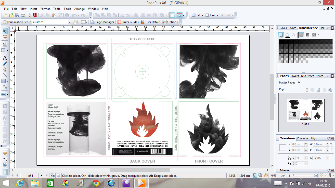
2. Used only one ink flow on each of the inner side panes and I felt the 6 separate images made it look too cluttered, of which opposes my simplistic style.
3. Changed the contrast and brightness on the extra pane so that the image was more interesting to look at and that the ink was more prominent than the container itself.
4. Change the colouring of the back pane to red. I did this as I felt it created a better contrast to that of the black and white, and links better to my music video. I also on this pane added in the rest of the songs -  as it is a Massive Attack Remastered, each song was picked specifically for the album and most were their best work. 

Here is an image of my progress;


Tuesday, 6 January 2015

Music Video Update

Due to feedback I have found that the lips in my video were not as bold and easily to see as first thought, therefore I I have begun playing around with lighting and contrast to find the best possible visual effect for the video.

Here is what I have found to be the best editing style so far;


Wednesday, 17 December 2014

Second Poster Ancillary

I have now begun the second ancillary poster, which is more the art stylistic side to my concept idea, here s what I have so far;


Ancillary Update

I have now added all images to my digipak an just need to do some finishing touches in order for it to be a coherent as possible;


Draft Video Before Editing

Here is my full video, however, I now need to edit certain ares and refine bits in order for it to be as professional as possible when meeting the deadline;


Monday, 15 December 2014

Acillary Update

I have begun playing around with typography on my poster and I have two coloured ideas that I like; I know need to decide which is best and suits the artists in the best way.


Ancillary Update

I have begun the colour change on my poster and added the artists name -  I now need to add the release date and possibly the singles name. So far I am very pleased with the poster and I believe it is on its way to becoming very successful.

Digipak Update

I have reworked my digipak and a now a lot happier with the result -  I have filled in all the panes other than the back as I am yet to edit my lip sync footage. 

Here is my digipak so far;


Digipak Update

I have begun the colour change process into black and white in order to keep continuity throughout my work. However I am still unhappy with the inner centre pain and so I may have to rethink what image to place there.