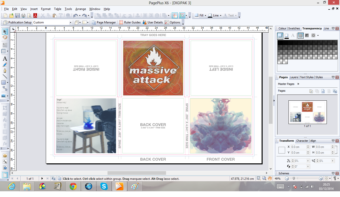
I decided to copy the image used and flip it - I did this as I felt it create a better ink effect, additionally it emphasised the haziness of the Bristolian Sage;
From this I then went on to add the logo - during experimenting with layouts, I decided to cover the entire pane with the logo, however by erasing the inner of the logo I was able to create a window for the ink to show through;


No comments:
Post a Comment