Thursday, 11 December 2014

Music Video update
I have begun filling in the gaps from my draft 3 video, and placing what clips I want where before I edited each part. I believe if I add the wanted clips first than edit them I can control my time better then editing as I go. I have now filled in and extra 30 seconds and the final ink drop at the end of my video is coming together to create a more intense effect - matching with the beat.
Tuesday, 9 December 2014
Digipak Update
I have now begun work on my left and right inner pane of my digipak, and so far I have collected 12 screen grabs to place into it. Although some are differing colours because of the inks used during production, I am able to easily colour correct them to be all black/white and matching.
Overall I am please with these two panes as I believe will come out really effectively.
Overall I am please with these two panes as I believe will come out really effectively.
Saturday, 6 December 2014
Music Video Update
Editing the colour to black and white - I have now begun this process and the video is coming along together nicely - It now looks more like a music video as opposed to compilation video.
Here is the full song, with the filled in bits I have completed
https://www.youtube.com/watch?v=_35L4WGsdDY&index=4&list=UUk7NdMhxtYe88NiWxjL9mEg
Here is the full song, with the filled in bits I have completed
https://www.youtube.com/watch?v=_35L4WGsdDY&index=4&list=UUk7NdMhxtYe88NiWxjL9mEg
Friday, 5 December 2014
Underlay of lip sync
I chose the grey and black colouring as I wanted to create a darker tone to the piece,
"Her eyes, she's on the dark side" - by using the colour scheme this allows for the audience to believe that being someones 'angel' isn't necessarily a good quality, thus the sensual and dangerous aspects of the lips are then reflected upon the ink (the audience)
Here is the first colour editing before inverting the colour tint;

"Her eyes, she's on the dark side" - by using the colour scheme this allows for the audience to believe that being someones 'angel' isn't necessarily a good quality, thus the sensual and dangerous aspects of the lips are then reflected upon the ink (the audience)
Here is the first colour editing before inverting the colour tint;
Thursday, 4 December 2014
Change to 28 seconds "Pan"
I decided during editing to change the panning effect around the tank as I felt the new effect I had created allowed for a more professional edit.
I took the main footage for the ink, I then cut every other section out to create the jumping effect. This was my result (I now need to edit the colour in order for continuity to be in place)
I took the main footage for the ink, I then cut every other section out to create the jumping effect. This was my result (I now need to edit the colour in order for continuity to be in place)
Music Video Update
During my recent work of my music video I edited the text for both; the name of the song and the title of the artist. Upon researching I found that Massive Attack were unconventional and used their typography to their artistic advantage - I its for that reason I used the song title "Angel" to match the beat of the song - around 10 seconds the first underlying beat of a metronome driving the music forward.
I then, when the high pitched (almost screeching) beat comes to play - I placed Massive Attacks title in white typography in order to contrast the dark and sudden colour change that the beat causes.


Wednesday, 3 December 2014
Ancillary Poster Beginning Stages
My first poster will be the same as the front pane of my digipak, I now need to add the release date. I want to keep the poster minimal as possible, therefore it will create an enigma code and the audience will want to know more, thus establishing a secondary active audience.


Digipak Update
I decided to copy the image used and flip it - I did this as I felt it create a better ink effect, additionally it emphasised the haziness of the Bristolian Sage;

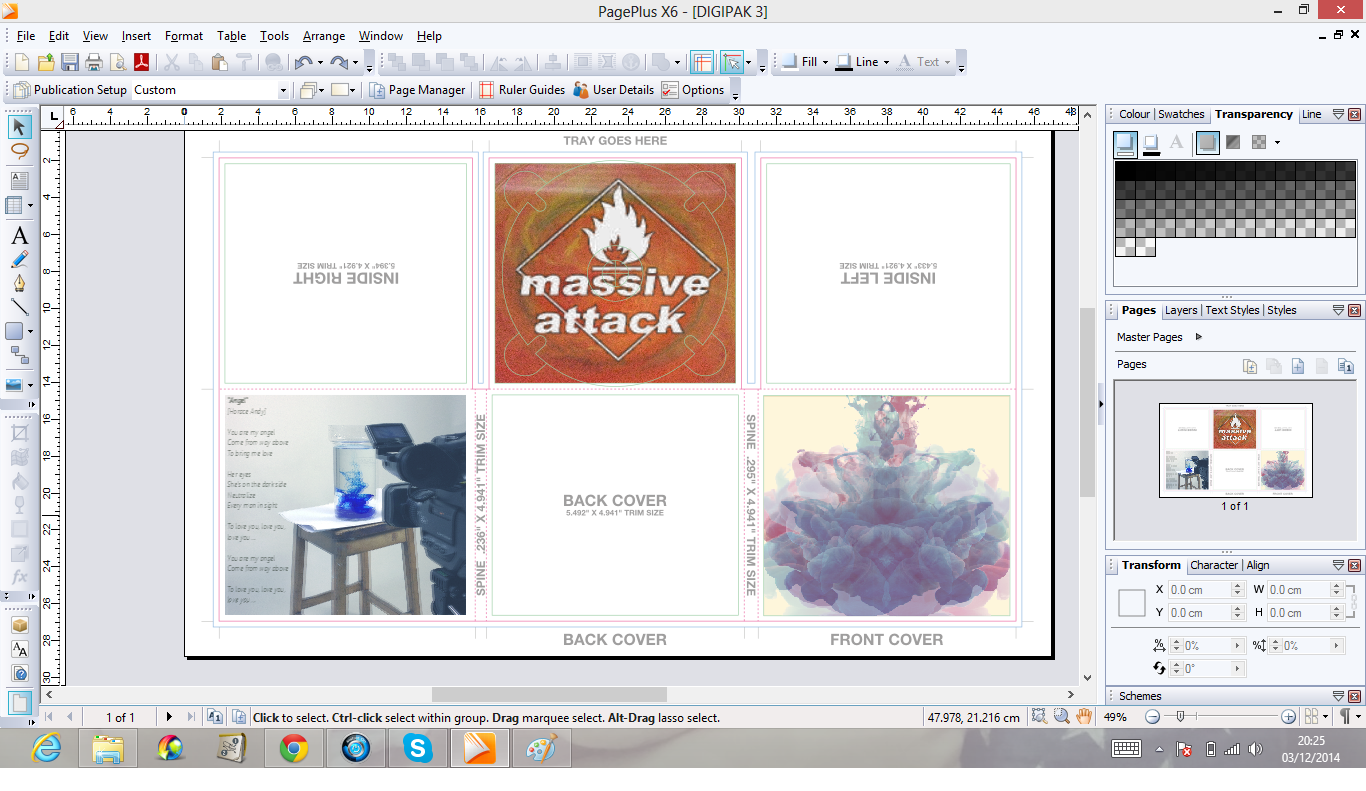

From this I then went on to add the logo - during experimenting with layouts, I decided to cover the entire pane with the logo, however by erasing the inner of the logo I was able to create a window for the ink to show through;
Subscribe to:
Posts (Atom)