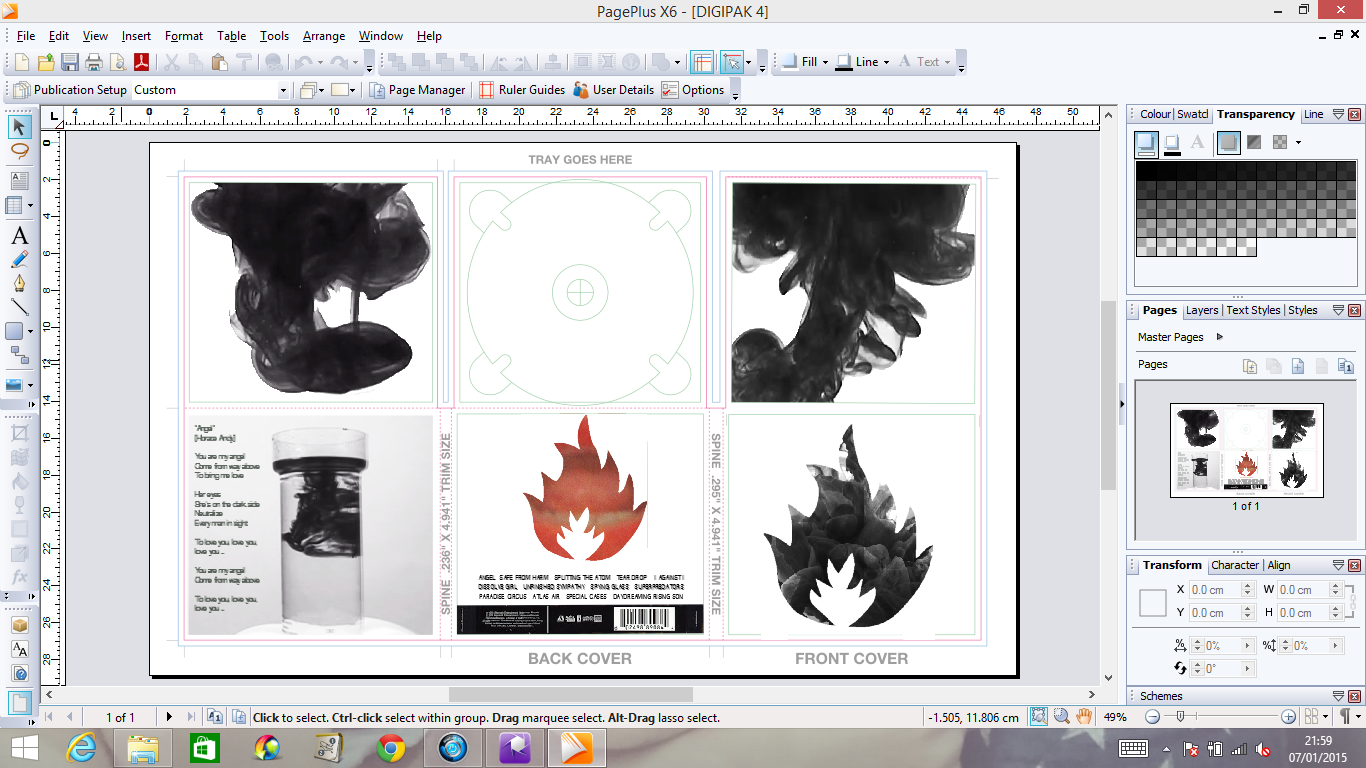
After receiving feedback from my teacher, stating that, although I do have lots of work and reflective comments. the stylising of my ancillaries makes it looks as though I am creating a single rather than an album. Therefore, from this I need to find a way of making the ancillaries look more like album work, without denying aspects from the video.
Some ideas I have;
- Removing the inner centre pane and replacing it with a logo/ institutional practices.
- Adding lyrics of different songs on the album to the inner right and left panes.
- Changing the layout of the secondary poster - although both are for the music video, I feel that I could change the secondary poster to a sort of "They're back" type thing. I initially got this idea from the Big Brother adverts that always create an enigma, and thus I could do a similar sort of stylising.
Friday, 30 January 2015
Friday, 23 January 2015
Evaluation Update
All my evaluation questions will be placed on a website built through Wix.com, I decided to do this as it adds another platform and a more interesting way to post my answers instead of just putting them all on blogger individually.
Questions 1 will be on wix itself, I feel as if this this be the best way to format it. Screens shots and labels will be used to note on aspects of my products.
Question 2 however I will make a website called Padlet in which I will be able to organise the sections of both my music video and ancillaries.
Question 3, as it is quite simplistic it will be created on Prezzi, as this will allow for the moderator to see clearly my step by step process of my answer.
Question 4 will be created on Real Time Board. Due to the question being based on the advantages and disadvantages of the technologies I have used, a mood board style organisation will allow for my answer to be clearer.
This is the website I am currently working on;
http://sarahmay33.wix.com/evaluation
Saturday, 17 January 2015
Dolby
Sarah,
Lots of work here and reflective comments. I would look at making the font style for the artist consistent and consider the way you have chosen to do a digipak and poster design that links to a music video single rather than a different yet distinctive styling to brand the artist.
Lots of work here and reflective comments. I would look at making the font style for the artist consistent and consider the way you have chosen to do a digipak and poster design that links to a music video single rather than a different yet distinctive styling to brand the artist.
Monday, 12 January 2015
Ancillary Update
After looking through my feedback I decided to totally rework my posters. Firstly I decided to scrap the use of the logo on the original poster and swapped it with a screen grab from my video, however I did keep the massive attack typography and some of the small print from the bottom. Additionally, I mixed the background aspect from the secondary poster with the first, this allowing it to look more professional and the background wasn't just white nor empty. And finally, instead of having the poster vertical I chose to rotate it to horizontal, this not only stopping the image from being disjointed and oddly sized, but also cause the poster to be out of the ordinary, just like Massive Attack themselves.
Overall I do prefer this poster to my original idea and I feel that it matches both the digipak and music video in terms of house style.
Here is my updated poster;


Overall I do prefer this poster to my original idea and I feel that it matches both the digipak and music video in terms of house style.
Here is my updated poster;
For my second poster I completed started from scratch and total reworked my entire ideas of how I wanted it, the only features I kept was the lips and the fact that this poster would have less text allowing it to obtain an enigma code - causing the audience to want to know more.
Here is the secondary poster;
Digipak Update
While looking at my digipak and going through my feed back, I have decided to lower the overall contrast so it isn't pure white but darker and greyer, this will also match the music video far better than before. Additionally, I have changed some of the images of the panes in order for the contrasting to match better.
Here are my changes so far;


Here are my changes so far;
Friday, 9 January 2015
Feed Back on improvements
Overall the feedback on my improvements was very good however, during the time in which I removed some clips to stop 1:40 looking like a montage I accidentally left a few blank gaps and therefore had black jump cuts.
Also my teacher said that the record label at the end needed to have a slower reveal and to be on screen for longer.
Here is my improvements;
http://youtu.be/juj4Dh5PT8E
Also my teacher said that the record label at the end needed to have a slower reveal and to be on screen for longer.
Here is my improvements;
http://youtu.be/juj4Dh5PT8E
Feedback Improvements Completed
The feedback I got from my first drafting of my music video, my teacher stated that I needed to improve on the following;
1. The lips needed to be brighter and better contrasted as she too felt they were not bold enough.
2. Around 1:40 there was a section that looked too much like a montage and therefore needed work done - additionally I realised that the timing of this section was off and needed to be refined.
3. Add in some form of text at the ending of the video, eg: artist title or the record label.
Since receiving the feedback I have worked on these factors and fixed any problems noted. Here is the result of this;
http://youtu.be/UO75h5Lkfvg
Music Video Update
In final cut pro, at a second attempt to remove the back ground and brighten the lips, I found that Colour Corrector worked best. By reducing the highlights, mid lights, low lights and the magnitude cause the contrast to become brights along with the saturation.
Although I did have trouble with finding this method as well as figuring it out, overall it had a better effect that keying out the background completely.
Here is the full video with the updated lips;
http://youtu.be/FK6baLwtV_U
Although I did have trouble with finding this method as well as figuring it out, overall it had a better effect that keying out the background completely.
Here is the full video with the updated lips;
http://youtu.be/FK6baLwtV_U
Thursday, 8 January 2015
Ancillary Update
After more consideration I felt that the lips belonged in the CD insert pane, not only do the shape fit into the contouring like I originally wanted, it also adds contrast in a better way then id did on the back pane - the red is now found in the centre of the pack. Also I played around with the layout of the song titles and additionally made the bar code larger than the industry typography.


Music Video Update
From my feed back I also learned that at 1 minute 40, the footage looked too much like a montage. Therefore I have removed a single 3 second clip - as the jump cuts didn't fit with the flow of the video. I also refined the editing of the speed and reversing to make it match the beat better.
Here is my video;
https://www.youtube.com/watch?v=kfXRaTs-Vzk&feature=youtu.be
Here is my video;
https://www.youtube.com/watch?v=kfXRaTs-Vzk&feature=youtu.be
Wednesday, 7 January 2015
Ancillary Update
After getting feedback, I have decided to redo some panes as it was flowing as well as I wanted it to. Therefore I have;
1. Removed the inner centre pane while I find a more suitable image.
2. Used only one ink flow on each of the inner side panes and I felt the 6 separate images made it look too cluttered, of which opposes my simplistic style.
3. Changed the contrast and brightness on the extra pane so that the image was more interesting to look at and that the ink was more prominent than the container itself.
4. Change the colouring of the back pane to red. I did this as I felt it created a better contrast to that of the black and white, and links better to my music video. I also on this pane added in the rest of the songs - as it is a Massive Attack Remastered, each song was picked specifically for the album and most were their best work.
Here is an image of my progress;
Tuesday, 6 January 2015
Music Video Update
Due to feedback I have found that the lips in my video were not as bold and easily to see as first thought, therefore I I have begun playing around with lighting and contrast to find the best possible visual effect for the video.
Here is what I have found to be the best editing style so far;
.JPG)
.JPG)
.JPG)
Here is what I have found to be the best editing style so far;
Monday, 5 January 2015
evaluation draft QUESTION FOUR
Question 4; how did you use media technologies in the construction and research, planning and evaluation stages?
1. Blogger – to post all my current work and demonstrate my progress
2. Prezzi
3. Real Time Board
4. Padlet
5. Wix.com – differing ways to present my research and ideas
6. Mobile Phone – for recording my first attempts and taking photos during the process as evidence
7. Digital Camera – to records my footage for the video
8. Apple macs
9. Final Cut Pro for digital editing – in order to edit and place pieces of my footage together to create the video
10. Photoshop for digital photo manipulation – to make my photos and screen grabs more interesting and professional for my digipak and poster
11. Serif PagePlus – the platform in which I created my digipak and posters
12. Digital Audio recorder – to record directors commentaries
13. General websites; google, da font, massive attack webpage – in order to carry out research an find appropriate texts/imagery/inspiration for my video
14. Web 2.0 sites; Youtube, Facebook, Esurveycreate.com – for audience feedback and youtube to post my original footage and edited stages of my video.
evaluation draft QUESTION THREE
What have you learned from your audience feedback?
Audience feedback is key when creating any product, therefore when making my video and ancillaries, for them to be the best they can, I wanted the audience to be as involved as possible.
My first questionnaire that I sent out was based on my original idea and what the audience thought of my; song, video idea and colouring. From this I learnt that my idea of remastered Massive Attack was liked, and that some members would actually love for this to happen in real life. They also noted that, although the idea of ink was different, it was very interesting, thus they were more intrigued by the video. The initial worry of the video being described as "different" made me think that it would be overly confused and hard to follow, especially when it came to the colouring. The house style of the video was key as it was the medium in which a meaning would be conveyed. Therefore, in order to get as much information from the audience I allowed them to vote for the most appropriate colours, as it meant that the meaning would be clearer to members of the audience.
As soon as I realised that my choice of a concept based video may confuse the audience, I then needed their feedback and comments on my progress of work, aiming for it to be as clear and interesting to the audience as they said in my original questionnaire.
One comment when editing my music video was that the lips were not as prominent as described in my written work, and needed to be bolder and possibly more contrasted. From this I then went onto experiment with colouring. I found that due to the ink overlay, the lips couldn't be fully bright and block red, over wise the ink will be unseen. After a few attempts I came to the conclusion that my lips wont be as pillar box red as I had hoped, however the darker tone I created adds more to the dark and sexualised nature of the piece.
evaluation draft QUESTION TWO
Question 2; how effective is the combination of your main product and ancillary texts?
When creating my ancillary tasks I wanted to create a link between them and my music video this house style and brand identity then would remove any continuity errors and confusion on behalf of the audience. If the audience themselves, do not see a link between the varying products, then they would not understand that they are all to do with the artist; additionally, in industry terms, the company could lose out on earning their highest potential.
The particular house style I followed was coloured; black, white and grey. The reason I did this was to match the colouring with the genre of Massive Attack; like I have said before Trip Hop is a combination of varying genres and artists. Therefore, in order to communicate this to the mass audience themselves, the contrasting colours of white, black and grey that were used in my video - represents the coming of one, like; Punk, Dance etc… Following this, the imagery of the ink from my music video is seen throughout my ancillaries, in order for the audience to make that connection and understanding that all pieces of media belong to the same artists.
During the creation of my ancillaries, I chose to follow a simplistic yet stylistic approach. This meant that my black, white and grey colouring would be the focal point of my products - although the ink and the lips would be what the audience would be looking at, if it wasn't for he colouring it wouldn't be as attractive and enticing. Thus, by transforming the footage into black and white, it meant that the video would become more dream like and hazy, linking back to the Bristolian saga from where Massive Attack originated. Additionally, as it contains aspects from the original Massive Attack days, die hard fans will see the nostalgic side to the Digipak and advert, and will want to go out and buy the products no matter what.
evaluation draft QUESTION ONE
Question 1; in what ways does your media product use, develop or challenge forms and conventions of real media products?
- Upon researching real music videos I came to understand the codes and conventions of which they consist of, these can include; Camera shots, Camera movements, Mise-En-Scene, Editing, Lighting, Costumes and Colour. These varying conventions allow for the audience to understand narrative, genre and emotions of the given video. As my music video is concept based, I then instantly reduced my conventions down to a smaller list, therefore I primarily used; Camera shots, Lighting (production values), Editing and colour (post production) to create my music video.
The conventional stereotype for Trip Hop is quite blankly ‘Stoners’, although represented negatively, are generally a friendly minority, peaceful and harmless. Therefore, in order to keep to the Bristolian ideology of a dream world, I wanted to only editing the pace ad colouring of the ink drops as I wanted to keep to the natural ambient flow. Other concept based videos for genres like dance and those similar, all follow a particular style, and as Trip Hop is a combination of all of these, I wanted to indulge the audience with similar codes and conventions as those seen in videos like, Gnarls Barkley 'Crazy' or The XX's 'Angel'. The lighting therefore needed to be as bright as possible in order to fully appreciate the colours used, therefore amplifying the dance iconography. Additionally, this then meant in editing I had clear footage and wouldn't need to re-shoot because lighting was incorrect.
As my video didn't include costumes or a narrative location, I had to create a separate way in which to apply mise-en-scene to my audience. The first way I did this was through colouring then came into the genre of the song, trip hop (a combination of varying genres,). This mass audience, although niche in age range, had varying types and classes of people. As Trip Hop united people all over Britain, the contrasting colours like, white, black and grey that were used in my video, represents the coming of one, like; Punk, Dance etc…
Additionally, I removed actors and any artist performance, (other than the lips) therefore the need for costuming was redundant, which meant I was able to reflect upon the music being the key feature. Although the audience don’t get to see the sexualisation of a full female body, the lips in the video syncing to "you are my angel" and, by directing it at a male audience, (with the additional signifier of red lipstick) creates a sexual theme; you could also suggest that the free forming ink flows represent the curves of a female. Even though the sexualising isn't direct and obvious, I wanted to allow an active audience to see these themes.
- During this research stage I also learned of the conventions of a Digipak, of which follow; Folds, Typography (title, artist, record label, promoters, and info about artist/song/album), imagery, Bar code, Packaging. My Digipak in particular had six folds opposed to the suggested as I wanted to create the album to be a special edition for the audience. The front and back panels are the main ‘promoters’ of the CD and are very much used to draw in the customers, therefore by using the simplistic and stylistic values of the artist, audience members were able to understand who the cd belonged too. The inside of the DigiPak is then used more for information and extra bits to do with the artist/song/album; additionally, the house style of the inside packaging stereotypically is more subtle compared to the outside packaging. It is for this reason the inner right and left panes were used to demonstrate values from the music video, therefore six screen grabs of the ink were placed in each left/right pane. The extra pane, in order to follow the conventions of a Digipak, was used for the lyrics of "Angel" - giving the audience direct information so they don't have to look it up. Finally, you then have the cardboard/paper folds around the plastic case which secures the disc in place; on this particular pane, in order to follow the contouring of the disc holder, I used an image taken during production and edited it to create a circular image. Over lapping this circular image what then Massive Attacks full logo (the only pace on the Digipak where you would actually find the name and logo together). Over all the house style of the Digipak followed that of the music video; black, white and grey.
- Upon researching about Real Advert conventions I found that the poster was split into sections and named from there; main focal point (image), artists name, title, small print (industry information), release date, age certificate/ratings if necessary and finally a tagline. A tagline is use to spark a particular response from the audience, without revealing too much information of the media. As a sort of enigma code, it allows the audience restricted information, causing them to want know more. For example, this can range from song lyrics to magazine quotations, "Most anticipated remake of the year". This then causes the audience to believe that, as other people high up in the music industry find it so remarkable, they too will share the same feelings - in a sense giving the tagline a two-step-flow aspect.
On my Real Advert I included featuring artists, therefore, this in itself will widen the circulation as it brings in a secondary audience. Not only will I gain sales from existing Massive Attack fans, I will also be able to include those of whom are featured on the album. As I did this, it meant I was able to dismiss typography that included the directors/labels name on the poster - although if I did include their name on the poster, connoting the importance of the creation (If the director is well known then this will help to attract the audience). However, as this is a remake a;bum a sort of 'special edition' it means that an established audience already know of whom the label/director is. Thus, by including featured artists, it creates a fresher and more up to date product for and ever demanding audience.
Subscribe to:
Comments (Atom)