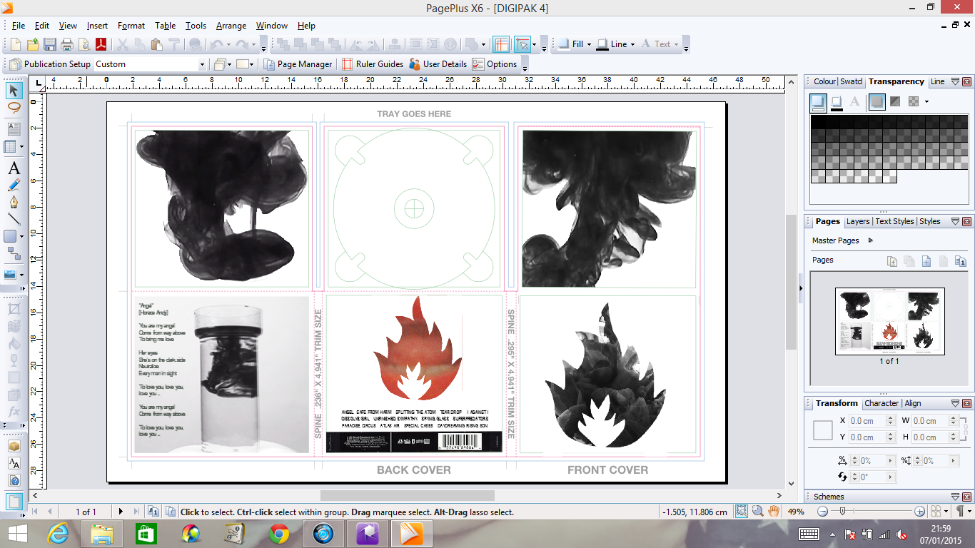
1. Removed the inner centre pane while I find a more suitable image.
2. Used only one ink flow on each of the inner side panes and I felt the 6 separate images made it look too cluttered, of which opposes my simplistic style.
3. Changed the contrast and brightness on the extra pane so that the image was more interesting to look at and that the ink was more prominent than the container itself.
4. Change the colouring of the back pane to red. I did this as I felt it created a better contrast to that of the black and white, and links better to my music video. I also on this pane added in the rest of the songs - as it is a Massive Attack Remastered, each song was picked specifically for the album and most were their best work.
Here is an image of my progress;

No comments:
Post a Comment